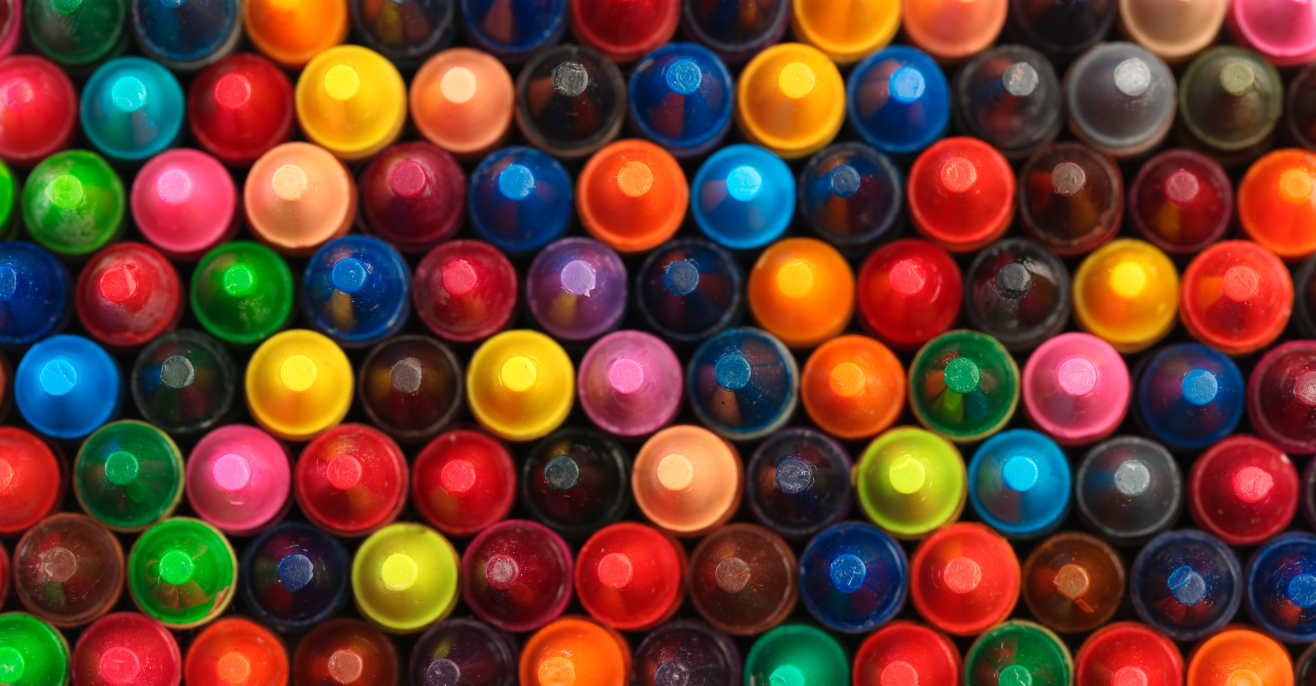
Happy National Crayon Day! Ah, remember how it smelled to crack open that fresh box of crayons? There’s truly nothing like it. And because we love any excuse to take a trip down memory lane AND celebrate, we knew we had to get in on the colorful fun today. The burning question in our team Slack channel this morning?
What’s your favorite Crayola color and why?
Here’s how the team responded:
JJ, Technical Coordinator
Midnight Blue is my favorite color! It reminds me of nighttime and that is usually the time of day that my mind is most focused.
Andrea, Sr. Brand/ Marketing Strategist
I’ve always loved the names of the brown hues Burnt Siena, Raw Umber, Bittersweet, but the colors themselves, not so much. Periwinkle on the other hand has it all, a magical name and a bright vibrant color.
Megan, Project Manager
Denim is my Crayola color pick because I love jeans! Or at least I did before the pandemic. Also, you can’t go wrong with a classic blue – it can be the sky, eyes, clothes, a house, a dolphin or even some funky hair!
Mars, Designer
This is a tough choice! My Crayola pick is Gel FX Blue. It’s a really nice mix between blue and green.
Anna, Intern
My favorite crayon color is Cerulean Blue… mainly because it reminds me of Miranda Priestly’s Cerulean monologue in my favorite movie, The Devil Wears Prada.
Susan, Designer
Robin’s Egg Blue is a tranquil tone that calms and soothes me. It reminds me of a beautiful spring day with adventures in the fresh outdoors.
Chelsi, Project Manager
Caribbean Green is such a beautiful Crayola color. It reminds me of being at one of my favorite places – I immediately feel the sunshine on my skin, the salty breeze in the air, and can see my toes resting in the Caribbean Green water.
Sue, Project Manager
Sky Blue – Blue has always been my favorite color, so it makes sense that sky blue is my favorite color of crayon. It reminds me of the color of the sky on a clear, warm spring day. Those kinds of days always make me happy after getting through a cold winter.
Grace, Intern
You can’t go wrong with Blue Green. I think it’s a beautiful color and it calms me. It’s been my go-to crayon since I was a kid.
Patty, President
Little-known fact – I am colorblind. (Even lesser-known fact, less than 1% of women are.) So crayons always beat colored pencils for me because of the labels. But I need those labels to be descriptive. So my favorite is simply Red.
Feeling blue? We’ve got more colorful insights for you!
We’ll admit that we’re the luckiest kids on the block. Why you ask? For starters, a lot of what we do requires us to explore the many colors of the world. #Winning. We know how powerful color in branding is. It impacts the way we perceive a brand and can have a powerful effect on our emotions as consumers. (See above.)
But are colors perceived the same way globally? Find the answer to this burning question in our blog here!
