
Summer is here and in full bloom! Nature’s beauty is full of colors that can spark the imagination. With that in mind we asked our BOLD designers what colors are inspiring them right now. Here are their thoughts:
Mars’s Pick…
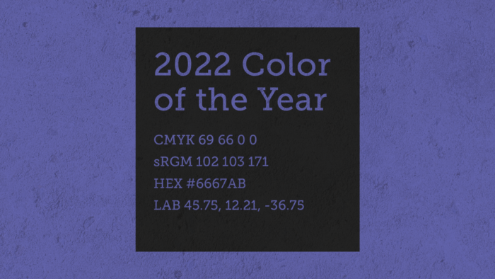
The color I chose is the 2022 Pantone color of the year which they call “Very Peri”. It’s not my favorite color, but I’m always fascinated by the colors they choose for each year. I haven’t used this except for a couple personal projects but now I can use it for this.
Rebecca’s Pick…
Both of these color combinations inspire me because they feel “fresh”. Words that come to mind when I see these colors are: refresh, enlighten, clean, and bright.
Susan’s Pick…
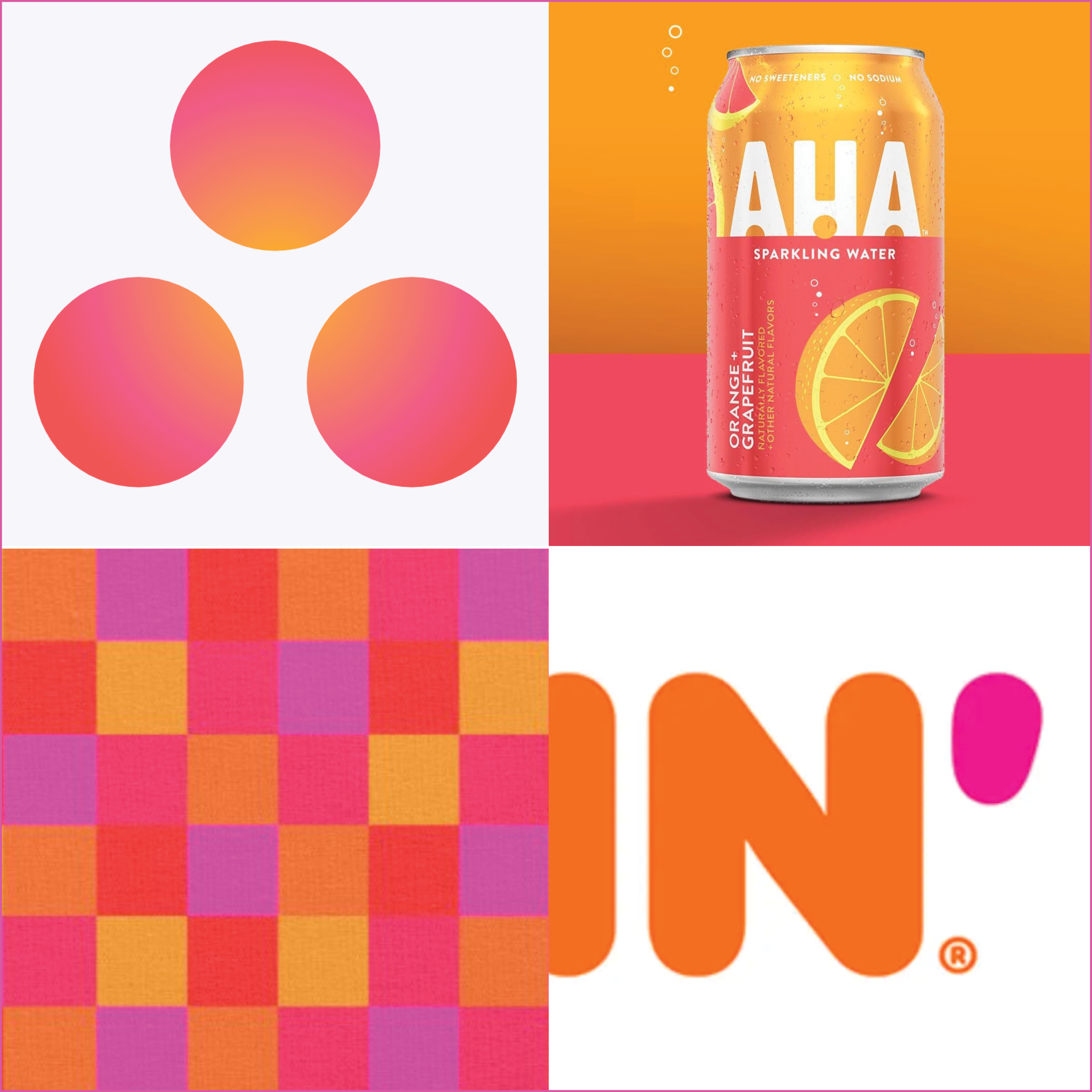
The energy of this combination makes me giddy. An orange and pink palette is happy, positive yet purposeful and when used – is so unexpected. It feels refreshing and bespoke for this time of year and the colors sizzle with each other. When brands make it part of their platform, it can be expressive and unforgettable – communicating what they are all about! The color combo has roots in the Pop Art craze but becomes emboldened in today’s digital landscape. If it needs a neutral or base tone, I prefer something different than the expected dark black or brown. Zesty purples work for text, adding flair to the palette and become the new black. It is deliciously decadent!
Autumn’s Pick…

Right now I am loving bright and bold summer colors! I love the contrast of warm red oranges with cool blues and teals. It gives a retro vibe that I’m always drawn to. I have these colors all over my house, it transforms the space into a cozy and vibrant home.