Consider this:
- Consumers create a first impression of a brand’s logo in just 10 seconds.
- It takes somewhere between 5 and 7 impressions before a consumer can recognize a logo.
- A “signature” color in a logo can increase brand recognition by 80%.
So, what does your logo say about you? Is it easily recognized by your audience? Does it stand out from your competitors? It’s unrealistic to expect that you’ll have the next McDonald’s or Nike logo, but that doesn’t mean you shouldn’t give attention to the design and presentation of your logo (and your brand as a whole, for that matter).
To keep things more interesting, much like the rest of the world, logo trends are always changing. Even the most classic brands refresh their logos from time to time. Why? Not only does what is visually appealing to consumers change over time, but technology has an impact on logo design too. In the past, logos were used primarily for signage and print advertisements. Now, logos must look good across all mediums, including tiny digital formats. When companies don’t update their logos to fit within a responsive digital space, the design of the logo suffers. Thus, your future customers aren’t recognizing and remembering your brand!
Logos used to be very detailed with multiple elements in one design that translated well into big spaces like full-page newspaper ads and tradeshow booths. Today’s trend is moving toward simplified designs that translate well across digital mediums.
The very best logos are simple and flexible
When a website is displayed on any particular device (desktop, tablet, mobile phone), the logo should be optimized to fit within the specified dimensions for each, and still be recognizable. Additionally, companies now have to design logo systems to account for any type of platform it may encounter (i.e. large-scale print, website, favicon, app button). Gone are the days of single-use logos!
Here are a few examples of companies that have recently refreshed their visual identity. Overall, you’ll notice a trend towards simpler, more flexible logo design.
Subway
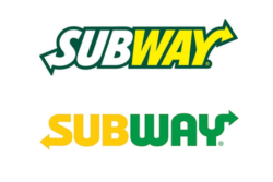
Subway’s new logo is bright yellow and green, instead of a more muted white and yellow. While the colors pop more, the typeface is much simpler and clean. The green outline has been removed and the font softened, giving it a sleek look and feel.
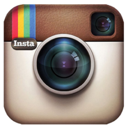
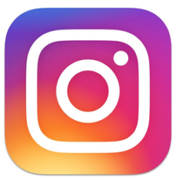
Instagram did away with its original logo, which had detailed imagery of a camera. They simplified the color and shape and removed the “insta” text. The visual of the camera is still strong, with a focus on a color gradient, rather than a direct depiction of camera.
Mastercard
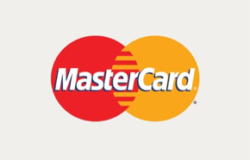
This is Mastercard’s first redesign in 20 years! With new technologies being developed in the financial world, the iconic Mastercard logo needed to represent the company’s new digital payment system. This redesign is optimized to work well on mobile. By removing the logotype from within the logo and placing it underneath, the icon is flexible enough to be used on its own. The all lowercase font choice is also a very “now” trend.
Southern Living


In the new Southern Living logo, the type has been made lighter and the kerning (the space between characters) was loosened just a bit. The serifs have also evolved into more efficient slabs. These small changes may not seem like a lot to the average consumer, but they make the world of a difference for designers, especially at small screen resolutions.
Metlife


Here’s MetLife’s explanation of their logo refresh:
“MetLife’s new visual branding is built around a clean, modern aesthetic. The striking new brandmark brings contemporary blue and green colors together in a symbol of partnership to form an M for MetLife. The iconic MetLife blue carries forth the brand’s legacy, but has been brightened and now lives alongside a new color – green – which represents life, renewal and energy. The broader MetLife brand palette expands to include a range of vibrant secondary colors, reflecting the diverse lives of its customers.” – MetLife Press Release
We must admit, we are sad to see Snoopy go!
How do you know if it’s time for a logo refresh?
With greater emphasis on web and digital today, it becomes very apparent when a company has not done its part to optimize its identity. You want to avoid consumers seeing your logo and thinking that you’re stuck in the past.
Take a look at your current logo. Do you think consumers would classify it as complex and outdated or clean and versatile? Does it appear crisp and clear in all sizes and formats?
While there’s no magic number for how often and when your logo should be revisited and updated, we recommend taking a look every 2 to 3 years. Research current trends, compare your logo to your competitors’ logos and analyze with your team if you think your logo reflects your company. Remember, you only have 10 seconds to create an impression of your brand based on your logo!
