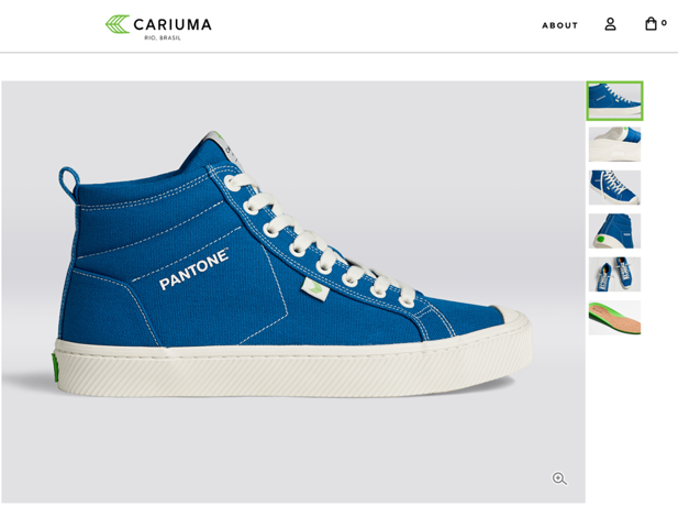
On December 4th, 2019, Pantone announced Classic Blue (aka Pantone 19-4052) as its Pantone Color of the Year for 2020. As a graphic designer, the Color of the Year is exciting! But for the non-creatives of the world, an announcement like “Color of the Year” may result in a shrug or eyeroll. If you’re wondering why you should care about a color, read on! Pantone’s Color of the Year actually impacts plenty of industries and directly influences design trends for the year.
A Colorful History Lesson
The Pantone Color System originated in 1963 to solve the problem of color matching in the printing industry. Think about it – every printing machine across the world has slight differences, so how do you make sure the purple you want is the purple you’re going to get? Pantone solved this problem by assigning every color, in every tone and tint, a number to classify it. To communicate that to the world, they produced a physical book for people to reference. Pantone is now the go-to color matching system for not only the print industry but also paint, textile and plastic manufacturing. Starting in 2000, Pantone started making observations about all these different industries and decided to call out a Color of the Year based on the trends they witnessed.
What Makes A Color Worthy?
The experts at The Pantone Color Institute keep their fingers on the pulse of design trends for the entire year. This includes monitoring industries like fashion, home and housewares, marketing, social media and even politics. They take stock of what people have been creating and hone in on one specific tone. After they formally announce their selection, even MORE designers and brands clamor onto the Color of the Year train and use it in everything from makeup to cupcake frosting.
In marketing, the Color of the Year has become increasingly influential when it comes to design and brand. It’s a little bit of a chicken or the egg scenario – the color is chosen because there is already some level of usage of the hue by trendsetters and early adopters. But after it’s formally announced, it becomes even more popular across a variety of industries. So spotting a trend actually makes it a bigger trend!


One of our favorite explanations of the significance of color in the fashion industry comes from the queen: Miranda Priestly (played by Meryl Streep) in The Devil Wears Prada. Watch her schooling us all on the often-unseen importance of color trends:
Color Us Impressed
The Color of the Year isn’t picked just because it’s a pretty shade. As you can see, a lot of thought from The Pantone Color Institute goes into the decision of what color will be THE color that will influence brands for the year to come. So, the next time you pull what you think is just a blue sweater out of your closet, remember the wise words of Miranda Priestly, “You’re wearing a sweater that was picked for you by the people in this room from a pile of stuff.”
Do you have a hot take on this year’s Pantone Color of the Year? We want to hear it! Send us a note at [email protected]. And if Classic Blue has you inspired to inject some color into your marketing, contact us.
